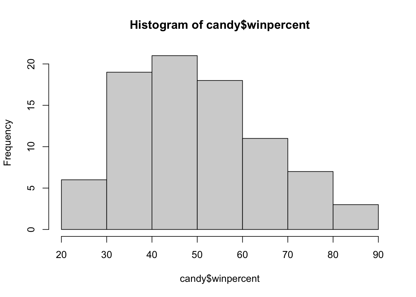
On average, chocolate candy is more highly ranked (60.92%) than fruity candy (44.12%).
Q12. Is this difference statistically significant?
t.test(chocolate_candy, fruity_candy)
    Welch Two Sample t-test

data:  chocolate_candy and fruity_candy
t = 6.2582, df = 68.882, p-value = 2.871e-08
alternative hypothesis: true difference in means is not equal to 0
95 percent confidence interval:
 11.44563 22.15795
sample estimates:
mean of x mean of y
 60.92153  44.11974
The difference is statistically significant as the p value is less than or equal to .05 (p=2.871e-08).
4 Overall Candy Rankings
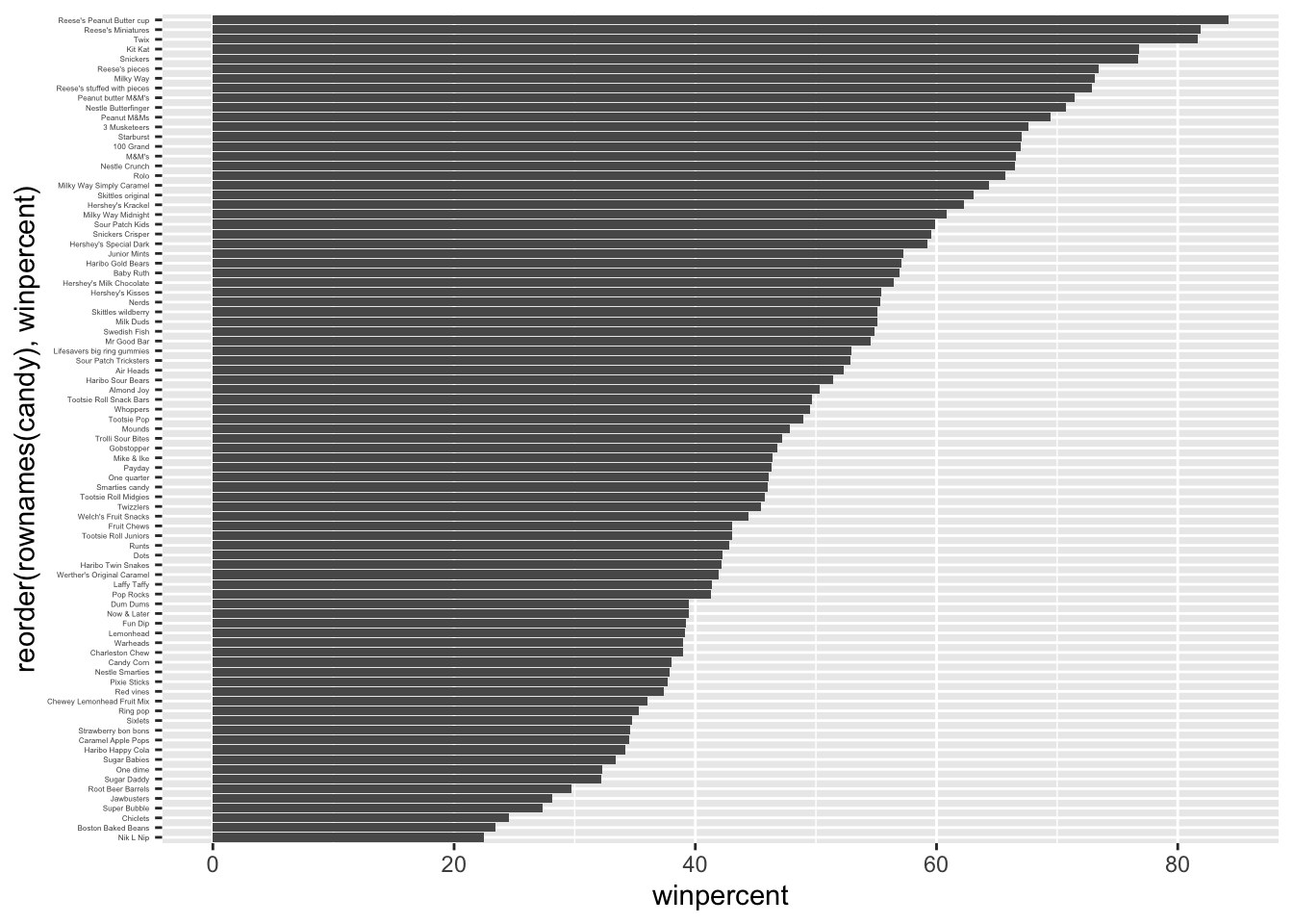
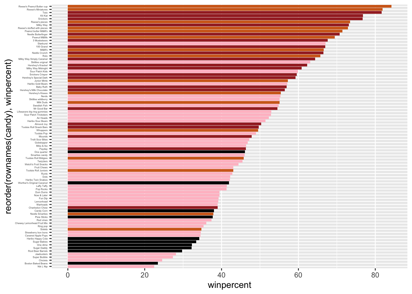
Q13. What are the five least liked candy types in this set?
The five least liked candy types in this set are Nik L Nip, Boston Baked Beans, Chiclets, Super Bubble, and Jawbusters.
candy |>arrange(winpercent) |>head(5)
                   chocolate fruity caramel peanutyalmondy nougat
Nik L Nip                  0      1       0              0      0
Boston Baked Beans         0      0       0              1      0
Chiclets                   0      1       0              0      0
Super Bubble               0      1       0              0      0
Jawbusters                 0      1       0              0      0
                   crispedricewafer hard bar pluribus sugarpercent pricepercent
Nik L Nip                         0    0   0        1        0.197        0.976
Boston Baked Beans                0    0   0        1        0.313        0.511
Chiclets                          0    0   0        1        0.046        0.325
Super Bubble                      0    0   0        0        0.162        0.116
Jawbusters                        0    1   0        1        0.093        0.511
                   winpercent
Nik L Nip            22.44534
Boston Baked Beans   23.41782
Chiclets             24.52499
Super Bubble         27.30386
Jawbusters           28.12744
Q14. What are the top 5 all time favorite candy types out of this set?
The 5 all time favorite candies out of this data set are Snickers, Kit Kat, Twix, Reese’s Miniatures, and Reese’s Peanut Butter cup.
The worst ranked chocolate candy are sixlets. > Q18. What is the best ranked fruity candy?
The best ranked fruity candy are starburst.
5 Taking a look at pricepercent
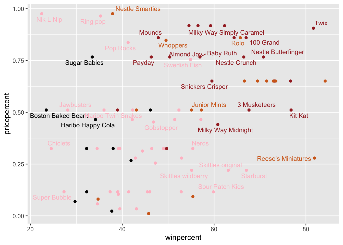
library(ggrepel)# How about a plot of win vs priceggplot(candy) +aes(winpercent, pricepercent, label=rownames(candy)) +geom_point(col=my_cols) +geom_text_repel(col=my_cols, size=3.3, max.overlaps =5)
Warning: ggrepel: 50 unlabeled data points (too many overlaps). Consider
increasing max.overlaps
Q19. Which candy type is the highest ranked in terms of winpercent for the least money - i.e. offers the most bang for your buck?
Tootsie Roll Midgies have the highest winpercent for the lowest pricepercent.
best <- candy$winpercent / candy$pricepercentcandy[which.max(best), c("winpercent", "pricepercent")]
                     winpercent pricepercent
Tootsie Roll Midgies   45.73675        0.011
Q20. What are the top 5 most expensive candy types in the dataset and of these which is the least popular?
The tip 5 most expensive candy types are Nik L Nip, Nestle Smarties, Ring Pop, Hershey’s Krackel, and Hershey’s Milk Chocolate. Of these the least popular is Nik L Nip.
ord <-order(candy$pricepercent, decreasing =TRUE)head( candy[ord,c(11,12)], n=5 )
                         pricepercent winpercent
Nik L Nip                       0.976   22.44534
Nestle Smarties                 0.976   37.88719
Ring pop                        0.965   35.29076
Hershey's Krackel               0.918   62.28448
Hershey's Milk Chocolate        0.918   56.49050
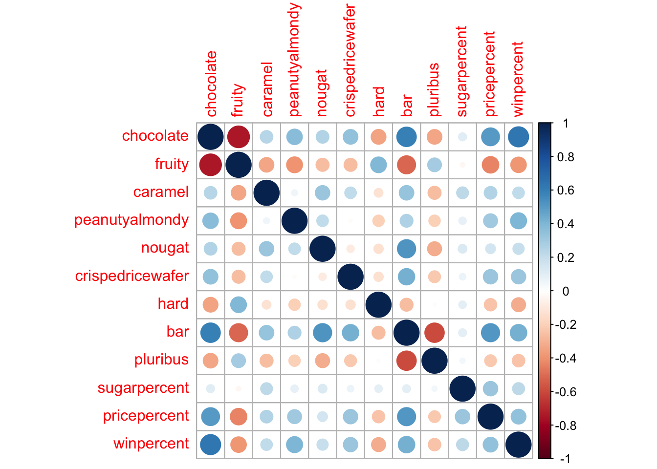
6 Exploring the correlation structure
library(corrplot)
corrplot 0.95 loaded
cij <-cor(candy)corrplot(cij)
Q22. Examining this plot what two variables are anti-correlated (i.e. have minus values)?
It seems like fruity and a variety of things. Of note are fruity and chocolate, fruity and bar, and pluribus and bar (among others). > Q23. Similarly, what two variables are most positively correlated?
It looks like it would be chocolate and bar. It seems many chocolate + XX pairs are blue (positively correlated).
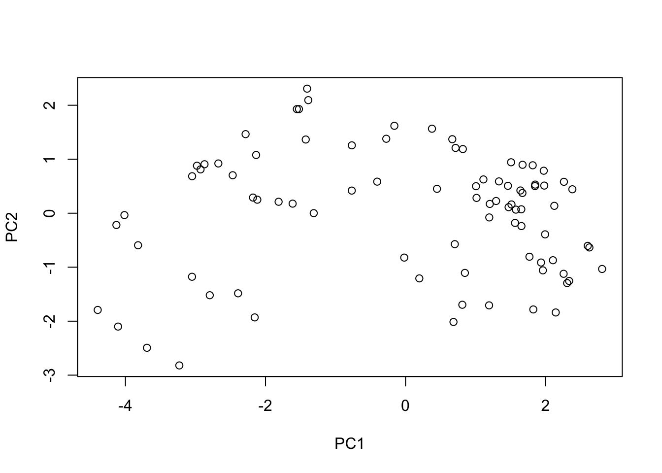
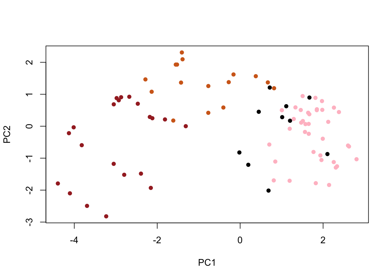
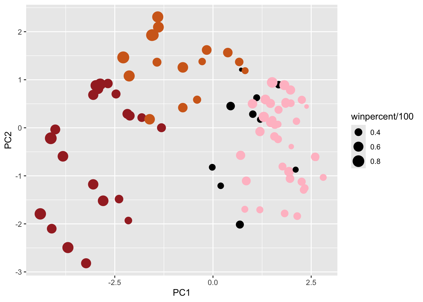
# Make a new data-frame with our PCA results and candy datamy_data <-cbind(candy, pca$x[,1:3])
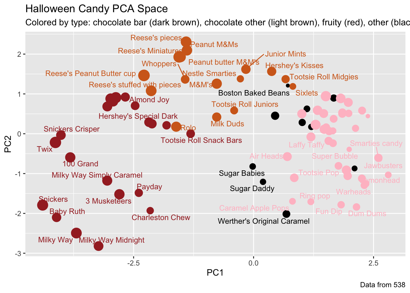
p <-ggplot(my_data) +aes(x=PC1, y=PC2, size=winpercent/100, text=rownames(my_data),label=rownames(my_data)) +geom_point(col=my_cols)p
library(ggrepel)p +geom_text_repel(size=3.3, col=my_cols, max.overlaps =7) +theme(legend.position ="none") +labs(title="Halloween Candy PCA Space",subtitle="Colored by type: chocolate bar (dark brown), chocolate other (light brown), fruity (red), other (black)",caption="Data from 538")
Warning: ggrepel: 39 unlabeled data points (too many overlaps). Consider
increasing max.overlaps
library(plotly)
Attaching package: 'plotly'
The following object is masked from 'package:ggplot2':

    last_plot
The following object is masked from 'package:stats':

    filter
The following object is masked from 'package:graphics':

    layout
ggplotly(p)
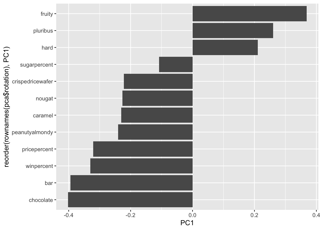
ggplot(pca$rotation) +aes(x = PC1, y =reorder(rownames(pca$rotation), PC1)) +geom_col()
Q24. Complete the code to generate the loadings plot above. What original variables are picked up strongly by PC1 in the positive direction? Do these make sense to you? Where did you see this relationship highlighted previously?
In the positive direction, fruity, pluribus, and hard are picked up. It feels a little confusing. They were negatively/ anticorrelated previously.
8 Summary
Q25. Based on your exploratory analysis, correlation findings, and PCA results, what combination of characteristics appears to make a “winning” candy? How do these different analyses (visualization, correlation, PCA) support or complement each other in reaching this conclusion?
The winning candy has chocolate, nougat, bars, and peanutyalmondy. The visualizations allowed us to look at costs and like-ability. The correlations helped us see the best combinations that led to better liking. PCA provided predictive powers.